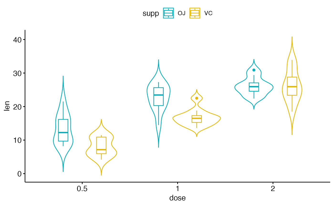
Create a violin plot with error bars. Violin plots are similar to box plots, except that they also show the kernel probability density of the data at different values.
Usage
ggviolin(
  data,
  x,
  y,
  combine = FALSE,
  merge = FALSE,
  color = "black",
  fill = "white",
  palette = NULL,
  alpha = 1,
  title = NULL,
  xlab = NULL,
  ylab = NULL,
  facet.by = NULL,
  panel.labs = NULL,
  short.panel.labs = TRUE,
  linetype = "solid",
  trim = FALSE,
  drop = TRUE,
  size = NULL,
  linewidth = NULL,
  width = 1,
  quantiles = NULL,
  quantile.linetype = NULL,
  quantile.type = NULL,
  quantile.alpha = NULL,
  quantile.colour = NULL,
  quantile.color = NULL,
  quantile.linewidth = NULL,
  quantile.size = NULL,
  draw_quantiles = NULL,
  select = NULL,
  remove = NULL,
  order = NULL,
  add = "mean_se",
  add.params = list(),
  error.plot = "pointrange",
  label = NULL,
  font.label = list(size = 11, color = "black"),
  label.select = NULL,
  repel = FALSE,
  label.rectangle = FALSE,
  position = position_dodge(0.8),
  ggtheme = theme_pubr(),
  show.n = FALSE,
  ...
)
Arguments
- data
a data frame
- x
character string containing the name of x variable.
- y
character vector containing one or more variables to plot
- combine
logical value. Default is FALSE. Used only when y is a vector containing multiple variables to plot. If TRUE, create a multi-panel plot by combining the plot of y variables.
- merge
logical or character value. Default is FALSE. Used only when y is a vector containing multiple variables to plot. If TRUE, merge multiple y variables in the same plotting area. Allowed values include also "asis" (TRUE) and "flip". If merge = "flip", then y variables are used as x tick labels and the x variable is used as grouping variable.
- color
outline color.
- fill
fill color.
- palette
the color palette to be used for coloring or filling by groups. Allowed values include "grey" for grey color palettes; brewer palettes e.g. "RdBu", "Blues", ...; or custom color palette e.g. c("blue", "red"); and scientific journal palettes from ggsci R package, e.g.: "npg", "aaas", "lancet", "jco", "ucscgb", "uchicago", "simpsons" and "rickandmorty".
- alpha
color transparency. Values should be between 0 and 1.
- title
plot main title.
- xlab
character vector specifying x axis labels. Use xlab = FALSE to hide xlab.
- ylab
character vector specifying y axis labels. Use ylab = FALSE to hide ylab.
- facet.by
character vector, of length 1 or 2, specifying grouping variables for faceting the plot into multiple panels. Should be in the data.
- panel.labs
a list of one or two character vectors to modify facet panel labels. For example, panel.labs = list(sex = c("Male", "Female")) specifies the labels for the "sex" variable. For two grouping variables, you can use for example panel.labs = list(sex = c("Male", "Female"), rx = c("Obs", "Lev", "Lev2") ).
- short.panel.labs
logical value. Default is TRUE. If TRUE, create short labels for panels by omitting variable names; in other words panels will be labelled only by variable grouping levels.
- linetype
line types.
- trim
If
TRUE(default), trim the tails of the violins to the range of the data. IfFALSE, don't trim the tails.- drop
logical, passed to
geom_violin(), controlling whether grouped sub-samples with fewer than two data points (for which no density can be computed) are dropped from the plot and the dodge position. By defaultggviolin()keeps grouped violins aligned with their other layers (e.g. added boxplots or dot plots) automatically: when you do not setdroporpositionand a grouped sub-group has a single data point, the empty dodge lane is reserved (equivalent todrop = FALSEtogether withposition = position_dodge(0.8, preserve = "single")) so the violins stay aligned. Balanced, ungrouped, and faceted plots are unaffected. Settingdroporpositionexplicitly turns off this automatic handling and uses exactly what you supply (#381).- size
Numeric value (e.g.: size = 1). change the size of points and outlines.
- linewidth
constant value specifying the line width.
- width
violin width.
- quantiles
numeric vector of quantiles to draw on the violin.
- quantile.linetype
linetype for quantile lines; set to draw quantiles with ggplot2 >= 4.0.0.
- quantile.type
quantile algorithm passed to ggplot2.
- quantile.alpha, quantile.colour, quantile.color, quantile.linewidth, quantile.size
aesthetics for quantile lines.
- draw_quantiles
![[Deprecated]](figures/lifecycle-deprecated.svg) Previous
specification of drawing quantiles.
Previous
specification of drawing quantiles.- select
character vector specifying which items to display.
- remove
character vector specifying which items to remove from the plot.
- order
character vector specifying the order of items.
- add
character vector for adding another plot element (e.g.: dot plot or error bars). Allowed values are one or the combination of: "none", "dotplot", "jitter", "boxplot", "point", "mean", "mean_se", "mean_sd", "mean_ci", "mean_range", "median", "median_iqr", "median_hilow", "median_q1q3", "median_mad", "median_range"; see ?desc_statby for more details.
- add.params
parameters (color, shape, size, fill, linetype) for the argument 'add'; e.g.: add.params = list(color = "red").
- error.plot
plot type used to visualize error. Allowed values are one of c("pointrange", "linerange", "crossbar", "errorbar", "upper_errorbar", "lower_errorbar", "upper_pointrange", "lower_pointrange", "upper_linerange", "lower_linerange"). Default value is "pointrange" or "errorbar". Used only when add != "none" and add contains one "mean_*" or "med_*" where "*" = sd, se, ....
- label
the name of the column containing point labels. Can be also a character vector with length = nrow(data).
- font.label
a list which can contain the combination of the following elements: the size (e.g.: 14), the style (e.g.: "plain", "bold", "italic", "bold.italic") and the color (e.g.: "red") of labels. For example font.label = list(size = 14, face = "bold", color ="red"). To specify only the size and the style, use font.label = list(size = 14, face = "plain").
- label.select
can be of two formats:
a character vector specifying some labels to show.
a list containing one or the combination of the following components:
top.upandtop.down: to display the labels of the top up/down points. For example,label.select = list(top.up = 10, top.down = 4).criteria: to filter, for example, by x and y variables values, use this:label.select = list(criteria = "`y` > 2 & `y` < 5 & `x` %in% c('A', 'B')").
- repel
a logical value, whether to use ggrepel to avoid overplotting text labels or not.
- label.rectangle
logical value. If TRUE, add rectangle underneath the text, making it easier to read.
- position
position adjustment, either as a string, or the result of a call to a position adjustment function (e.g.
position_dodge(0.8)). Used to control the spacing between grouped elements.- ggtheme
function, ggplot2 theme name. Default value is theme_pubr(). Set ggtheme = NULL to skip applying a ggpubr theme, so the plot keeps ggplot2 default theme or the theme set globally via theme_set(). Allowed values include ggplot2 official themes: theme_gray(), theme_bw(), theme_minimal(), theme_classic(), theme_void(), ....
- show.n
logical. If TRUE, displays the number of observations (
"n = <count>") at the top of each group. Off by default. When the groups are dodged (acolor/fillgrouping with a dodgingposition), one count is shown per group; otherwise a single count is shown per x-axis tick. Counts respectselect/removeand are computed per facet.- ...
other arguments to be passed to
geom_violin,ggparandfacet.
Details
The plot can be easily customized using the function ggpar(). Read ?ggpar for changing:
main title and axis labels: main, xlab, ylab
axis limits: xlim, ylim (e.g.: ylim = c(0, 30))
axis scales: xscale, yscale (e.g.: yscale = "log2")
color palettes: palette = "Dark2" or palette = c("gray", "blue", "red")
legend title, labels and position: legend = "right"
plot orientation : orientation = c("vertical", "horizontal", "reverse")
Examples
# Load data
data("ToothGrowth")
df <- ToothGrowth
# Basic plot
# +++++++++++++++++++++++++++
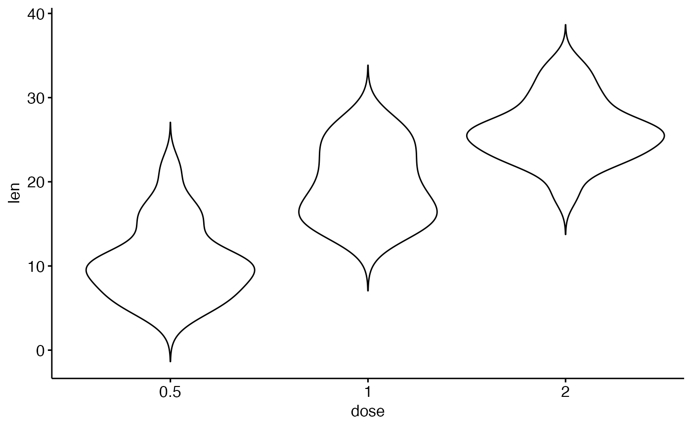
ggviolin(df, x = "dose", y = "len")
 # Change the plot orientation: horizontal
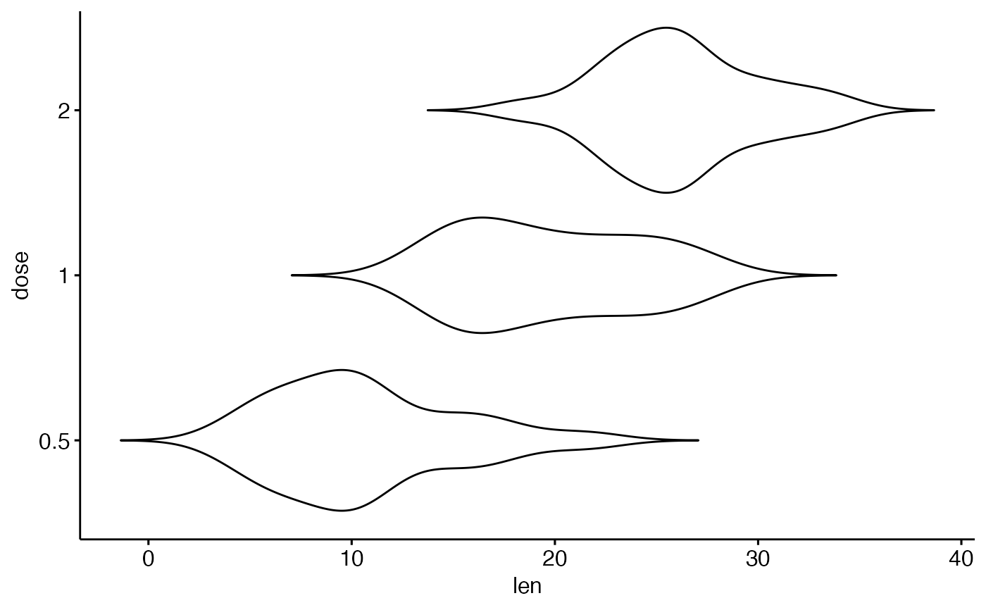
ggviolin(df, "dose", "len", orientation = "horiz")
# Change the plot orientation: horizontal
ggviolin(df, "dose", "len", orientation = "horiz")
 # Add summary statistics
# ++++++++++++++++++++++++++
# Draw quantiles
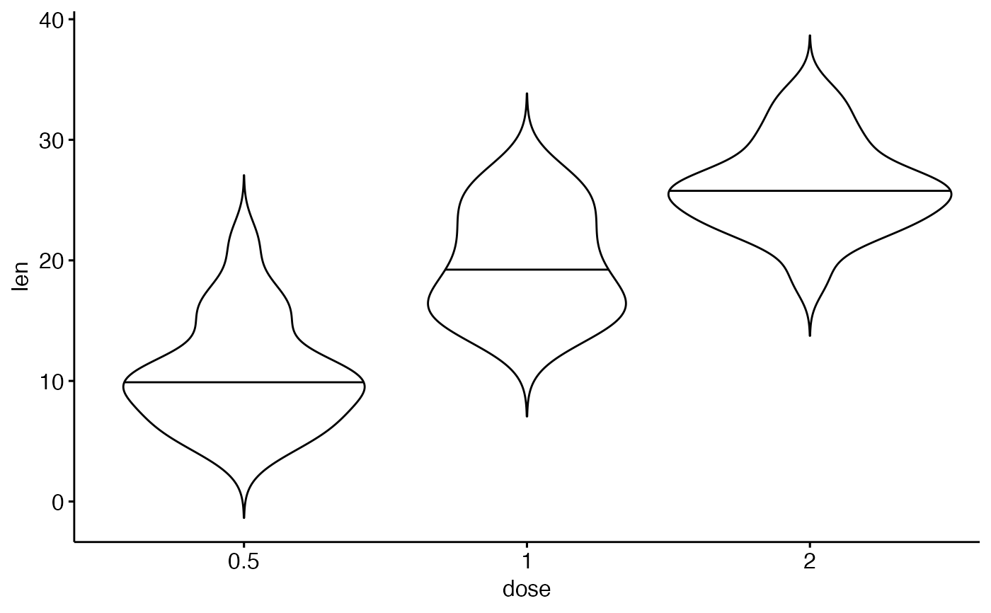
ggviolin(df, "dose", "len",
add = "none",
quantiles = 0.5, quantile.linetype = "dashed"
)
# Add summary statistics
# ++++++++++++++++++++++++++
# Draw quantiles
ggviolin(df, "dose", "len",
add = "none",
quantiles = 0.5, quantile.linetype = "dashed"
)
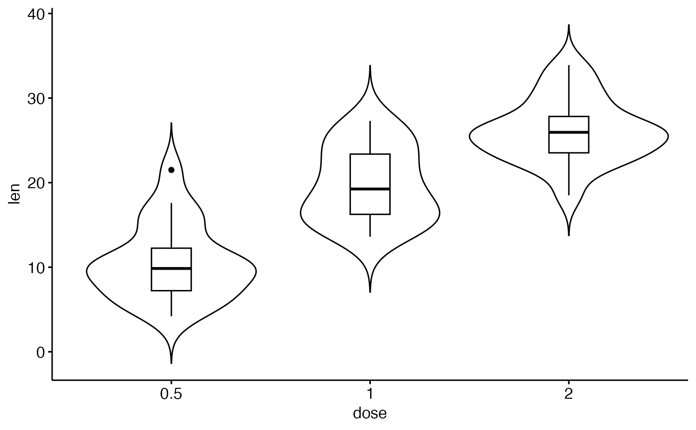
 # Add box plot
ggviolin(df,
x = "dose", y = "len",
add = "boxplot"
)
# Add box plot
ggviolin(df,
x = "dose", y = "len",
add = "boxplot"
)
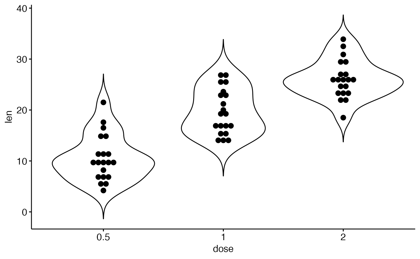
 ggviolin(df,
x = "dose", y = "len",
add = "dotplot"
)
#> Bin width defaults to 1/30 of the range of the data. Pick better value with
#> `binwidth`.
ggviolin(df,
x = "dose", y = "len",
add = "dotplot"
)
#> Bin width defaults to 1/30 of the range of the data. Pick better value with
#> `binwidth`.
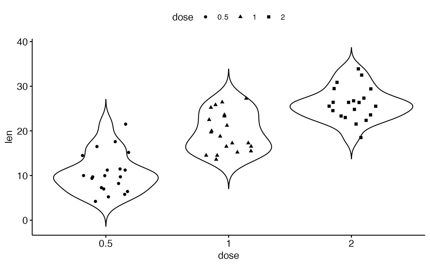
 # Add jitter points and
# change point shape by groups ("dose")
ggviolin(df,
x = "dose", y = "len",
add = "jitter", shape = "dose"
)
# Add jitter points and
# change point shape by groups ("dose")
ggviolin(df,
x = "dose", y = "len",
add = "jitter", shape = "dose"
)
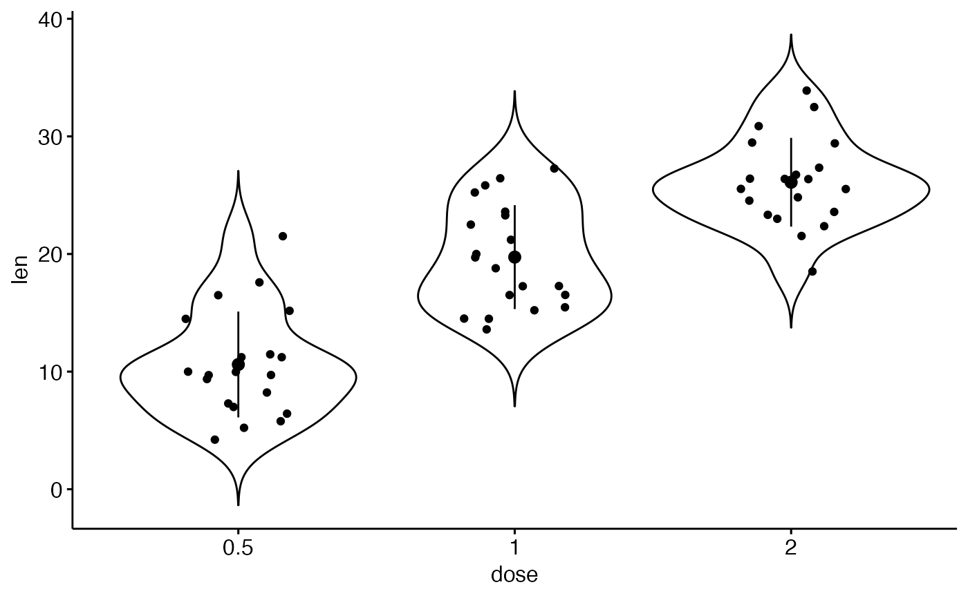
 # Add mean_sd + jittered points
ggviolin(df,
x = "dose", y = "len",
add = c("jitter", "mean_sd")
)
# Add mean_sd + jittered points
ggviolin(df,
x = "dose", y = "len",
add = c("jitter", "mean_sd")
)
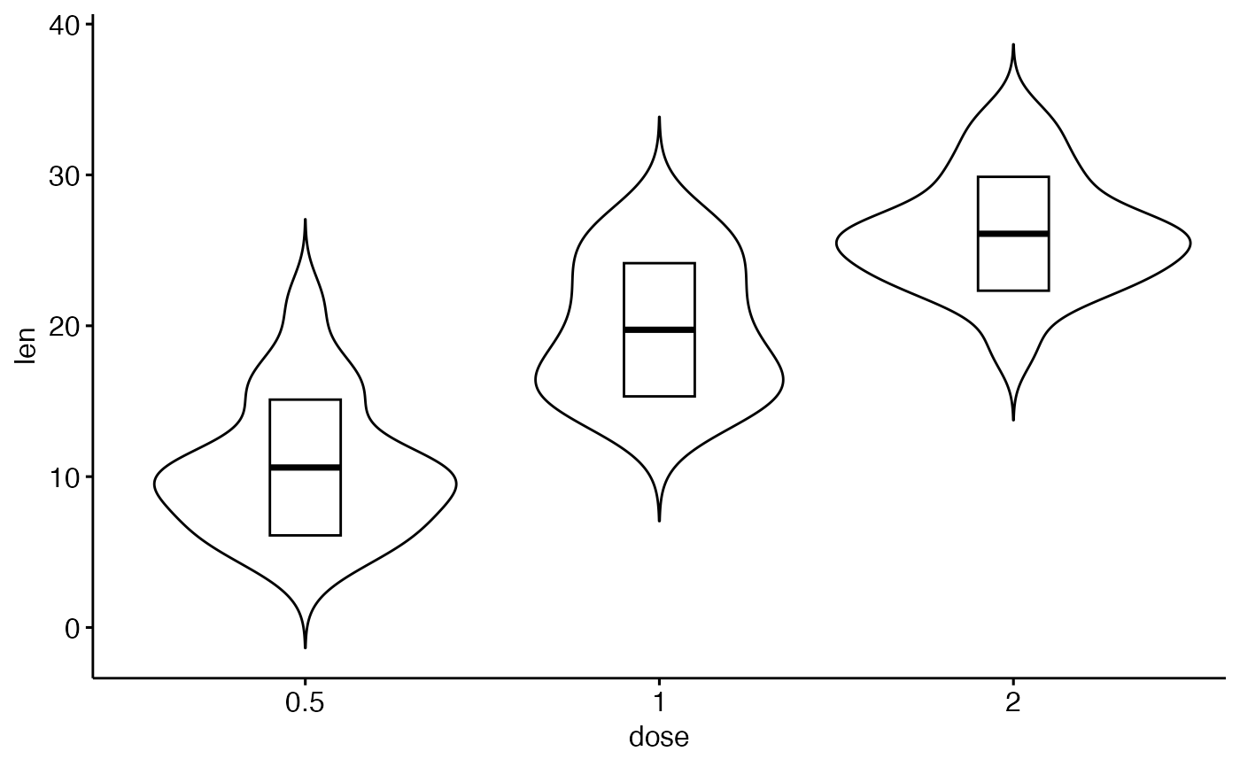
 # Change error.plot to "crossbar"
ggviolin(df,
x = "dose", y = "len",
add = "mean_sd", error.plot = "crossbar"
)
# Change error.plot to "crossbar"
ggviolin(df,
x = "dose", y = "len",
add = "mean_sd", error.plot = "crossbar"
)
 # Change colors
# +++++++++++++++++++++++++++
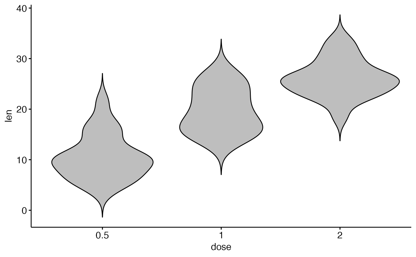
# Change outline and fill colors
ggviolin(df, "dose", "len",
color = "black", fill = "gray"
)
# Change colors
# +++++++++++++++++++++++++++
# Change outline and fill colors
ggviolin(df, "dose", "len",
color = "black", fill = "gray"
)
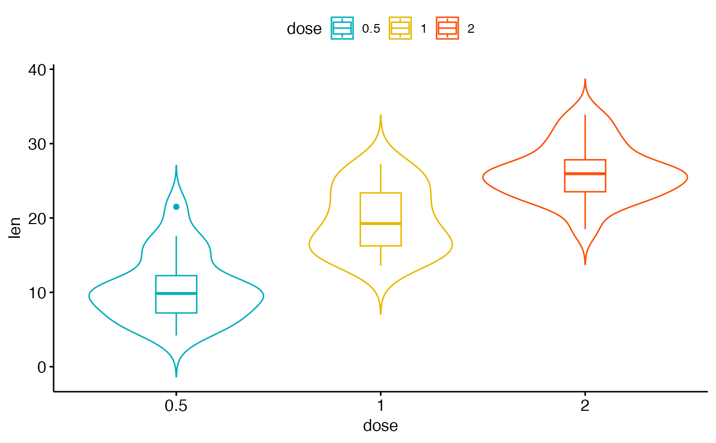
 # Change outline colors by groups: dose
# Use custom color palette and add boxplot
ggviolin(df, "dose", "len",
color = "dose",
palette = c("#00AFBB", "#E7B800", "#FC4E07"),
add = "boxplot"
)
# Change outline colors by groups: dose
# Use custom color palette and add boxplot
ggviolin(df, "dose", "len",
color = "dose",
palette = c("#00AFBB", "#E7B800", "#FC4E07"),
add = "boxplot"
)
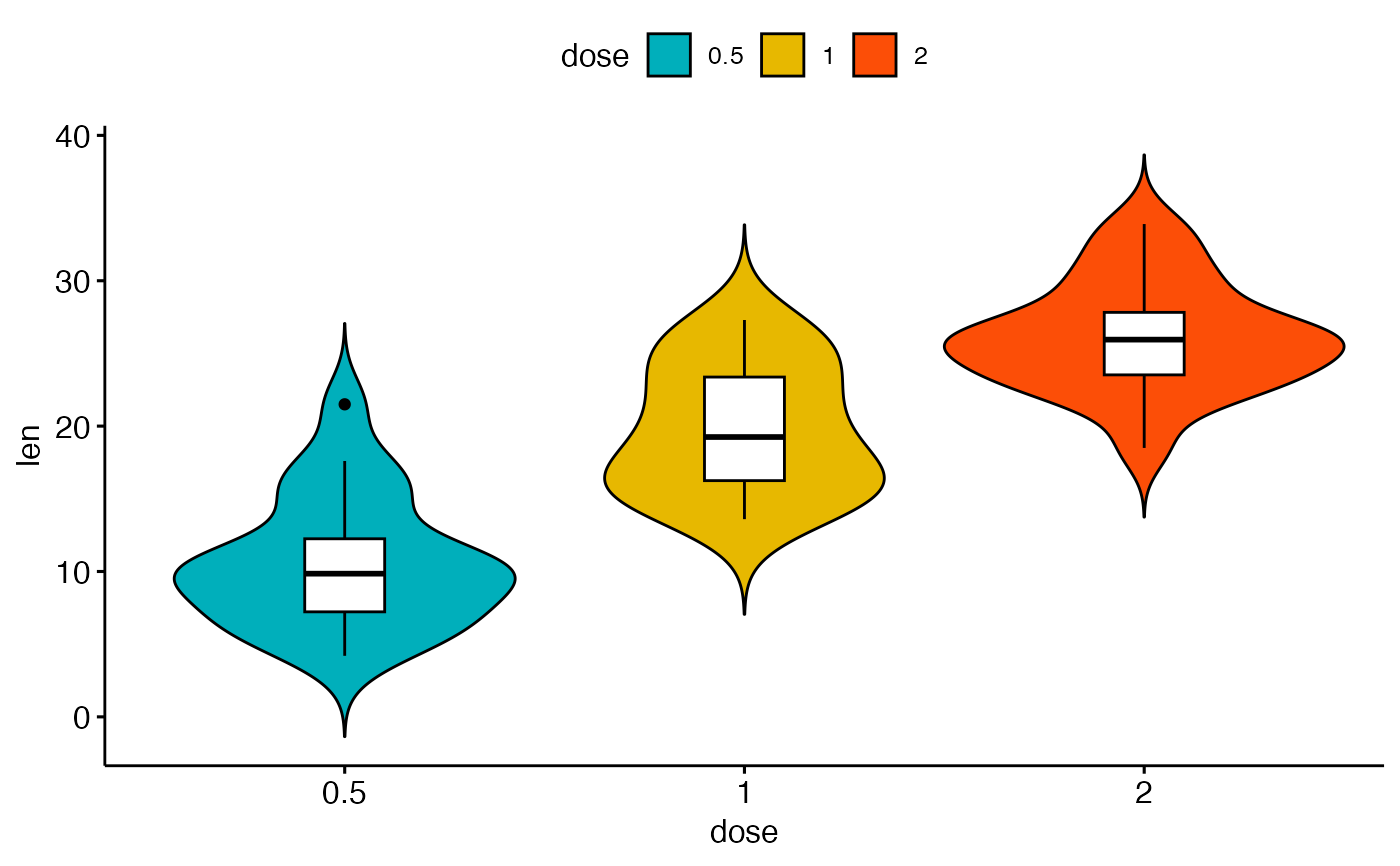
 # Change fill color by groups: dose
# add boxplot with white fill color
ggviolin(df, "dose", "len",
fill = "dose",
palette = c("#00AFBB", "#E7B800", "#FC4E07"),
add = "boxplot", add.params = list(fill = "white")
)
# Change fill color by groups: dose
# add boxplot with white fill color
ggviolin(df, "dose", "len",
fill = "dose",
palette = c("#00AFBB", "#E7B800", "#FC4E07"),
add = "boxplot", add.params = list(fill = "white")
)
 # Plot with multiple groups
# +++++++++++++++++++++
# fill or color box plot by a second group : "supp"
ggviolin(df, "dose", "len",
color = "supp",
palette = c("#00AFBB", "#E7B800"), add = "boxplot"
)
# Plot with multiple groups
# +++++++++++++++++++++
# fill or color box plot by a second group : "supp"
ggviolin(df, "dose", "len",
color = "supp",
palette = c("#00AFBB", "#E7B800"), add = "boxplot"
)