Create a box plot with points. Box plots display a group of numerical data through their quartiles.
ggboxplot(
  data,
  x,
  y,
  combine = FALSE,
  merge = FALSE,
  color = "black",
  fill = "white",
  palette = NULL,
  title = NULL,
  xlab = NULL,
  ylab = NULL,
  bxp.errorbar = FALSE,
  bxp.errorbar.width = 0.4,
  facet.by = NULL,
  panel.labs = NULL,
  short.panel.labs = TRUE,
  linetype = "solid",
  size = NULL,
  linewidth = NULL,
  width = 0.7,
  notch = FALSE,
  outliers = TRUE,
  outlier.shape = 19,
  select = NULL,
  remove = NULL,
  order = NULL,
  add = "none",
  add.params = list(),
  error.plot = "pointrange",
  label = NULL,
  font.label = list(size = 11, color = "black"),
  label.select = NULL,
  repel = FALSE,
  label.rectangle = FALSE,
  ggtheme = theme_pubr(),
  ...
)
Arguments
- data
a data frame
- x
character string containing the name of x variable.
- y
character vector containing one or more variables to plot
- combine
logical value. Default is FALSE. Used only when y is a vector containing multiple variables to plot. If TRUE, create a multi-panel plot by combining the plot of y variables.
- merge
logical or character value. Default is FALSE. Used only when y is a vector containing multiple variables to plot. If TRUE, merge multiple y variables in the same plotting area. Allowed values include also "asis" (TRUE) and "flip". If merge = "flip", then y variables are used as x tick labels and the x variable is used as grouping variable.
- color
outline color.
- fill
fill color.
- palette
the color palette to be used for coloring or filling by groups. Allowed values include "grey" for grey color palettes; brewer palettes e.g. "RdBu", "Blues", ...; or custom color palette e.g. c("blue", "red"); and scientific journal palettes from ggsci R package, e.g.: "npg", "aaas", "lancet", "jco", "ucscgb", "uchicago", "simpsons" and "rickandmorty".
- title
plot main title.
- xlab
character vector specifying x axis labels. Use xlab = FALSE to hide xlab.
- ylab
character vector specifying y axis labels. Use ylab = FALSE to hide ylab.
- bxp.errorbar
logical value. If TRUE, shows error bars of box plots.
- bxp.errorbar.width
numeric value specifying the width of box plot error bars. Default is 0.4.
- facet.by
character vector, of length 1 or 2, specifying grouping variables for faceting the plot into multiple panels. Should be in the data.
- panel.labs
a list of one or two character vectors to modify facet panel labels. For example, panel.labs = list(sex = c("Male", "Female")) specifies the labels for the "sex" variable. For two grouping variables, you can use for example panel.labs = list(sex = c("Male", "Female"), rx = c("Obs", "Lev", "Lev2") ).
- short.panel.labs
logical value. Default is TRUE. If TRUE, create short labels for panels by omitting variable names; in other words panels will be labelled only by variable grouping levels.
- linetype
line types.
- size
Numeric value (e.g.: size = 1). change the size of points and outlines.
- linewidth
constant value specifying the line width.
- width
numeric value between 0 and 1 specifying box width.
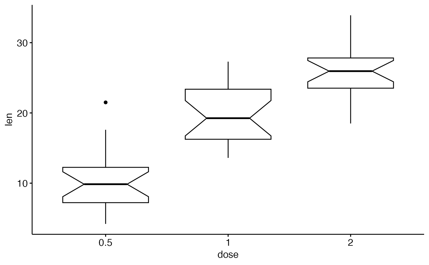
- notch
If
FALSE(default) make a standard box plot. IfTRUE, make a notched box plot. Notches are used to compare groups; if the notches of two boxes do not overlap, this suggests that the medians are significantly different.- outliers
Whether to display (
TRUE) or discard (FALSE) outliers from the plot. Hiding or discarding outliers can be useful when, for example, raw data points need to be displayed on top of the boxplot. By discarding outliers, the axis limits will adapt to the box and whiskers only, not the full data range. If outliers need to be hidden and the axes needs to show the full data range, please useoutlier.shape = NAinstead.- outlier.shape
point shape of outlier. Default is 19. To hide outlier, specify
outlier.shape = NA. When jitter is added, then outliers will be automatically hidden.- select
character vector specifying which items to display.
- remove
character vector specifying which items to remove from the plot.
- order
character vector specifying the order of items.
- add
character vector for adding another plot element (e.g.: dot plot or error bars). Allowed values are one or the combination of: "none", "dotplot", "jitter", "boxplot", "point", "mean", "mean_se", "mean_sd", "mean_ci", "mean_range", "median", "median_iqr", "median_hilow", "median_q1q3", "median_mad", "median_range"; see ?desc_statby for more details.
- add.params
parameters (color, shape, size, fill, linetype) for the argument 'add'; e.g.: add.params = list(color = "red").
- error.plot
plot type used to visualize error. Allowed values are one of c("pointrange", "linerange", "crossbar", "errorbar", "upper_errorbar", "lower_errorbar", "upper_pointrange", "lower_pointrange", "upper_linerange", "lower_linerange"). Default value is "pointrange" or "errorbar". Used only when add != "none" and add contains one "mean_*" or "med_*" where "*" = sd, se, ....
- label
the name of the column containing point labels. Can be also a character vector with length = nrow(data).
- font.label
a list which can contain the combination of the following elements: the size (e.g.: 14), the style (e.g.: "plain", "bold", "italic", "bold.italic") and the color (e.g.: "red") of labels. For example font.label = list(size = 14, face = "bold", color ="red"). To specify only the size and the style, use font.label = list(size = 14, face = "plain").
- label.select
can be of two formats:
a character vector specifying some labels to show.
a list containing one or the combination of the following components:
top.upandtop.down: to display the labels of the top up/down points. For example,label.select = list(top.up = 10, top.down = 4).criteria: to filter, for example, by x and y variabes values, use this:label.select = list(criteria = "`y` > 2 & `y` < 5 & `x` %in% c('A', 'B')").
- repel
a logical value, whether to use ggrepel to avoid overplotting text labels or not.
- label.rectangle
logical value. If TRUE, add rectangle underneath the text, making it easier to read.
- ggtheme
function, ggplot2 theme name. Default value is theme_pubr(). Allowed values include ggplot2 official themes: theme_gray(), theme_bw(), theme_minimal(), theme_classic(), theme_void(), ....
- ...
other arguments to be passed to
geom_boxplot,ggparandfacet.
Details
The plot can be easily customized using the function ggpar(). Read ?ggpar for changing:
main title and axis labels: main, xlab, ylab
axis limits: xlim, ylim (e.g.: ylim = c(0, 30))
axis scales: xscale, yscale (e.g.: yscale = "log2")
color palettes: palette = "Dark2" or palette = c("gray", "blue", "red")
legend title, labels and position: legend = "right"
plot orientation : orientation = c("vertical", "horizontal", "reverse")
Suggestions for the argument "add"
Suggested values are one of c("dotplot", "jitter").
See also
ggpar, ggviolin, ggdotplot
and ggstripchart.
Examples
# Load data
data("ToothGrowth")
df <- ToothGrowth
# Basic plot
# +++++++++++++++++++++++++++
# width: change box plots width
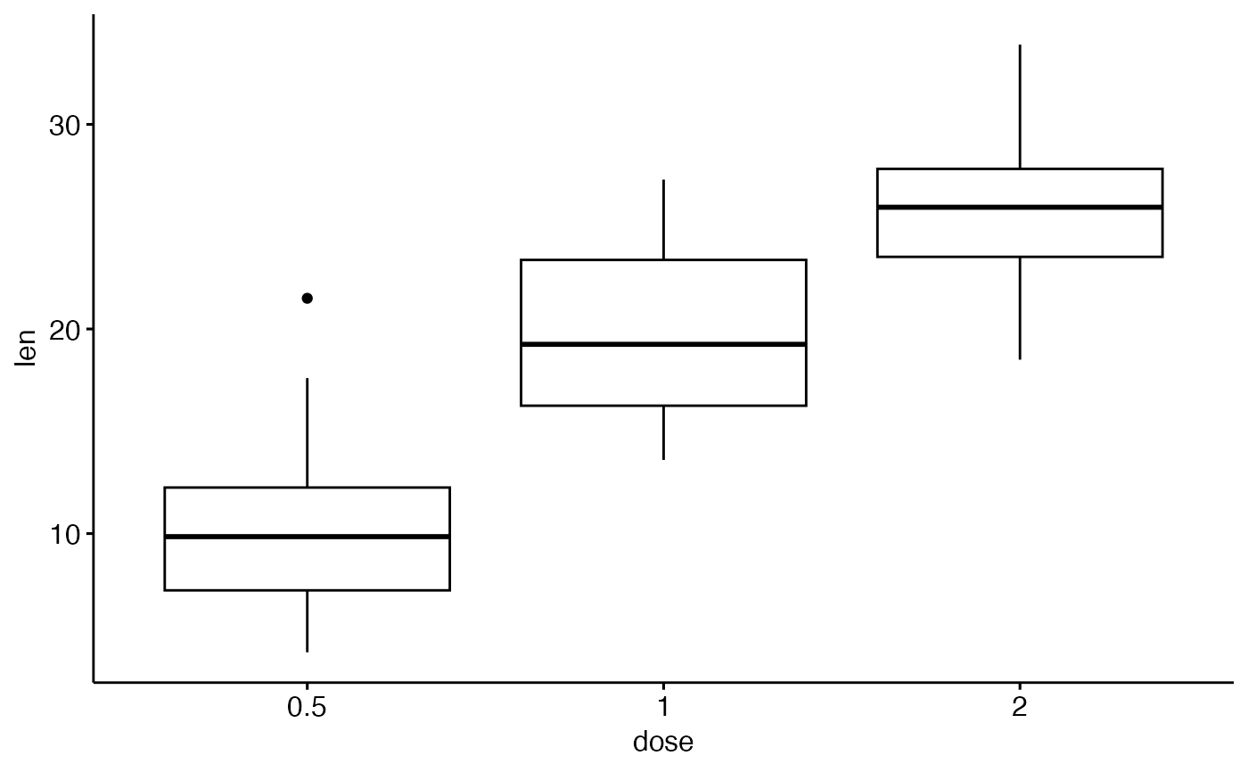
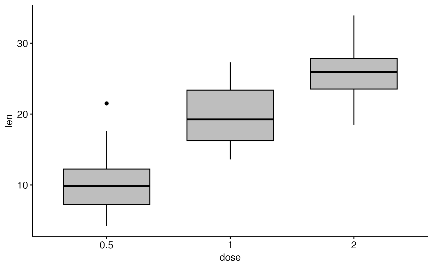
ggboxplot(df, x = "dose", y = "len", width = 0.8)
 # Change orientation: horizontal
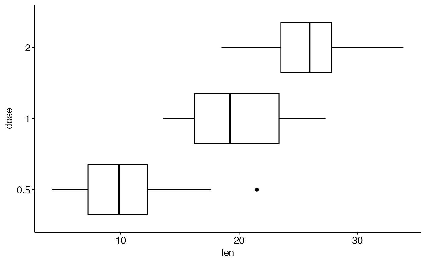
ggboxplot(df, "dose", "len", orientation = "horizontal")
# Change orientation: horizontal
ggboxplot(df, "dose", "len", orientation = "horizontal")
 # Notched box plot
ggboxplot(df, x = "dose", y = "len",
notch = TRUE)
# Notched box plot
ggboxplot(df, x = "dose", y = "len",
notch = TRUE)
 # Add dots
# ++++++++++++++++++++++++++
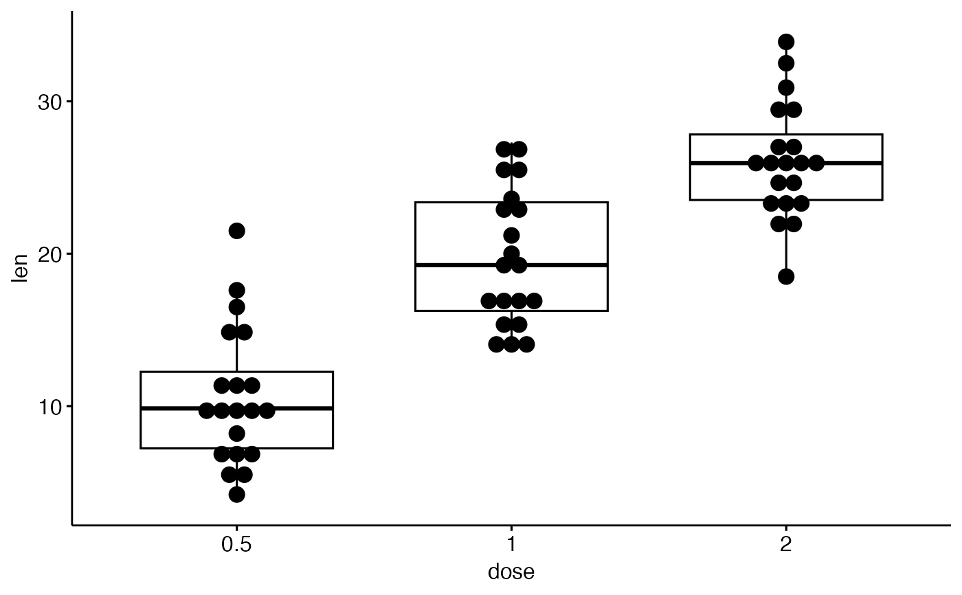
ggboxplot(df, x = "dose", y = "len",
add = "dotplot")
#> Bin width defaults to 1/30 of the range of the data. Pick better value with
#> `binwidth`.
# Add dots
# ++++++++++++++++++++++++++
ggboxplot(df, x = "dose", y = "len",
add = "dotplot")
#> Bin width defaults to 1/30 of the range of the data. Pick better value with
#> `binwidth`.
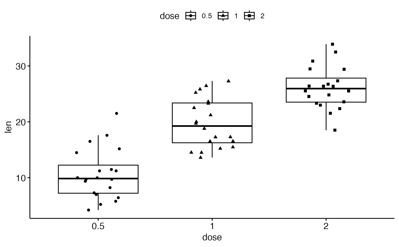
 # Add jitter points and change the shape by groups
ggboxplot(df, x = "dose", y = "len",
add = "jitter", shape = "dose")
# Add jitter points and change the shape by groups
ggboxplot(df, x = "dose", y = "len",
add = "jitter", shape = "dose")
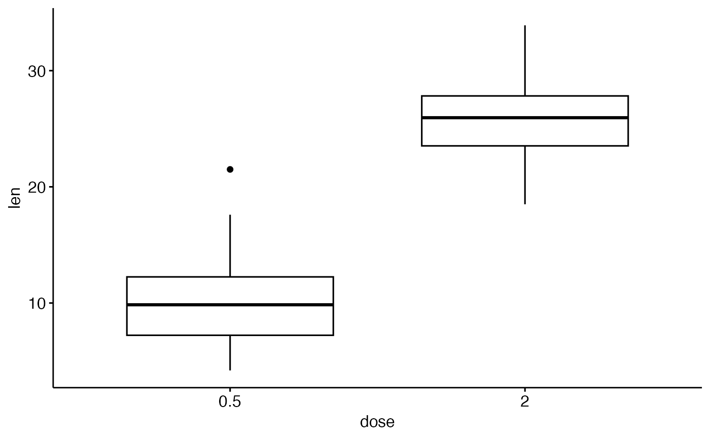
 # Select and order items
# ++++++++++++++++++++++++++++++
# Select which items to display: "0.5" and "2"
ggboxplot(df, "dose", "len",
select = c("0.5", "2"))
# Select and order items
# ++++++++++++++++++++++++++++++
# Select which items to display: "0.5" and "2"
ggboxplot(df, "dose", "len",
select = c("0.5", "2"))
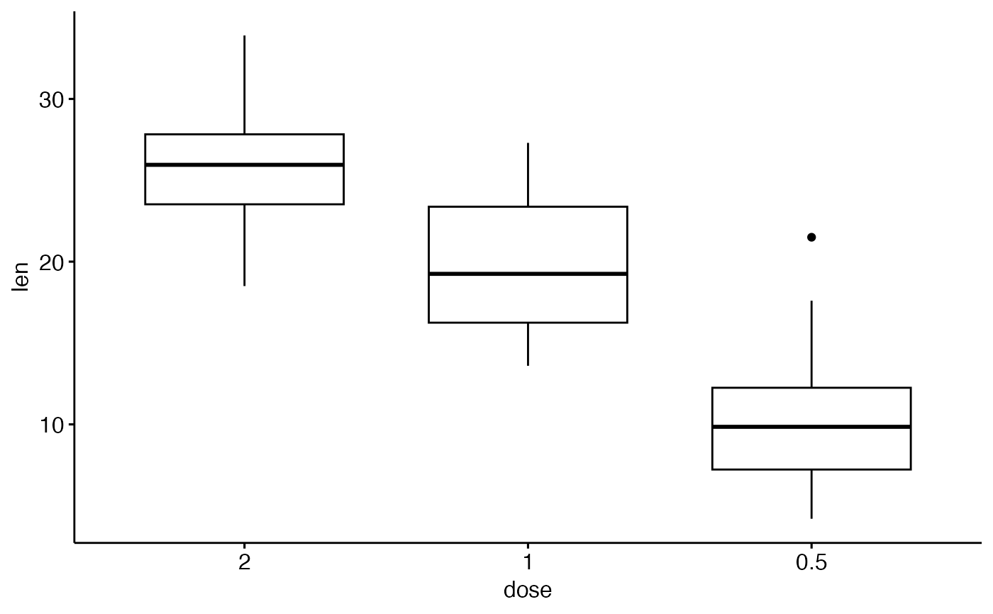
 # Change the default order of items
ggboxplot(df, "dose", "len",
order = c("2", "1", "0.5"))
# Change the default order of items
ggboxplot(df, "dose", "len",
order = c("2", "1", "0.5"))
 # Change colors
# +++++++++++++++++++++++++++
# Change outline and fill colors
ggboxplot(df, "dose", "len",
color = "black", fill = "gray")
# Change colors
# +++++++++++++++++++++++++++
# Change outline and fill colors
ggboxplot(df, "dose", "len",
color = "black", fill = "gray")
 # Change outline colors by groups: dose
# Use custom color palette
# Add jitter points and change the shape by groups
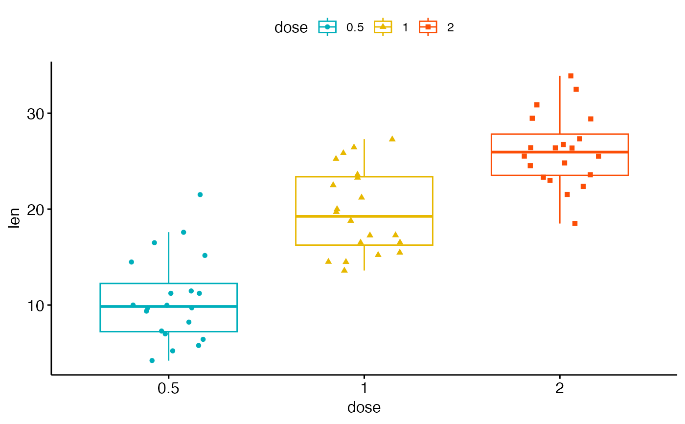
ggboxplot(df, "dose", "len",
color = "dose", palette =c("#00AFBB", "#E7B800", "#FC4E07"),
add = "jitter", shape = "dose")
# Change outline colors by groups: dose
# Use custom color palette
# Add jitter points and change the shape by groups
ggboxplot(df, "dose", "len",
color = "dose", palette =c("#00AFBB", "#E7B800", "#FC4E07"),
add = "jitter", shape = "dose")
 # Change fill color by groups: dose
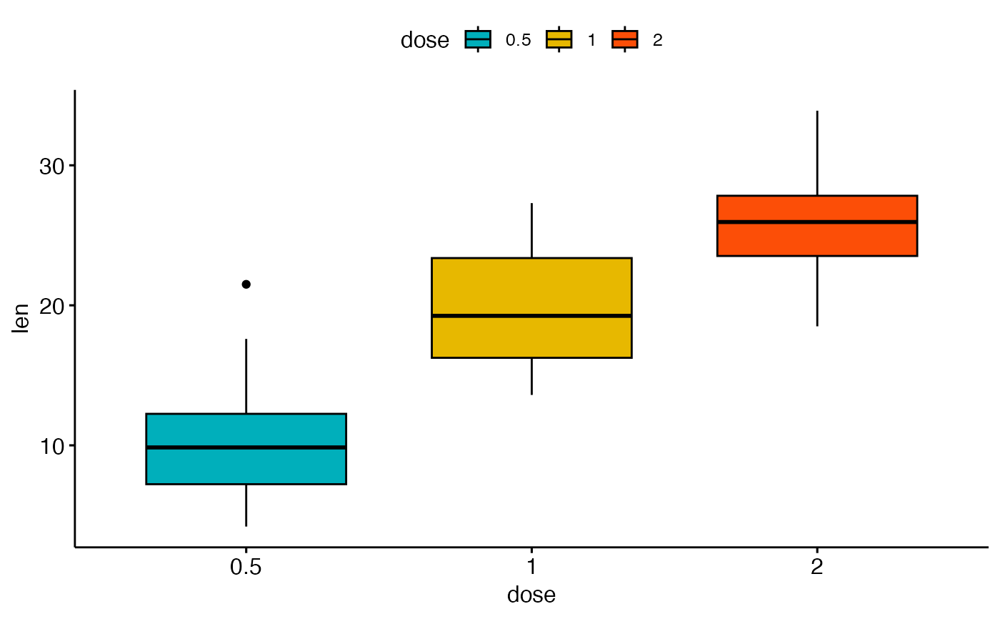
ggboxplot(df, "dose", "len",
fill = "dose", palette = c("#00AFBB", "#E7B800", "#FC4E07"))
# Change fill color by groups: dose
ggboxplot(df, "dose", "len",
fill = "dose", palette = c("#00AFBB", "#E7B800", "#FC4E07"))
 # Box plot with multiple groups
# +++++++++++++++++++++
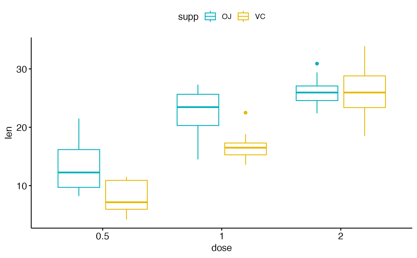
# fill or color box plot by a second group : "supp"
ggboxplot(df, "dose", "len", color = "supp",
palette = c("#00AFBB", "#E7B800"))
# Box plot with multiple groups
# +++++++++++++++++++++
# fill or color box plot by a second group : "supp"
ggboxplot(df, "dose", "len", color = "supp",
palette = c("#00AFBB", "#E7B800"))