
This function can be used to visualize the contribution of rows/columns from the results of Principal Component Analysis (PCA), Correspondence Analysis (CA), Multiple Correspondence Analysis (MCA), Factor Analysis of Mixed Data (FAMD), and Multiple Factor Analysis (MFA) functions.
Read more: Principal Component Analysis (PCA) in R: Compute, Visualize & Interpret.
Usage
fviz_contrib(
  X,
  choice = c("row", "col", "var", "ind", "quanti.var", "quali.var", "group",
    "partial.axes"),
  axes = 1,
  fill = "steelblue",
  color = "steelblue",
  sort.val = c("desc", "asc", "none"),
  top = Inf,
  xtickslab.rt = 45,
  ggtheme = theme_minimal(),
  display = c("bar", "heatmap"),
  ...
)

fviz_pca_contrib(
  X,
  choice = c("var", "ind"),
  axes = 1,
  fill = "steelblue",
  color = "steelblue",
  sortcontrib = c("desc", "asc", "none"),
  top = Inf,
  ...
)
Arguments
- X
an object of class PCA, CA, MCA, FAMD, MFA and HMFA [FactoMineR]; prcomp and princomp [stats]; dudi, pca, coa and acm [ade4]; ca [ca package].
- choice
allowed values are "row" and "col" for CA; "var" and "ind" for PCA or MCA; "var", "ind", "quanti.var", "quali.var" and "group" for FAMD, MFA and HMFA.
- axes
a numeric vector specifying the dimension(s) of interest.
- fill
a fill color for the bar plot.
- color
an outline color for the bar plot.
- sort.val
a string specifying whether the value should be sorted. Allowed values are "none" (no sorting), "asc" (for ascending) or "desc" (for descending).
- top
a numeric value specifying the number of top elements to be shown.
- xtickslab.rt
rotation angle for x axis tick labels. Default is 45 degrees.
- ggtheme
function, ggplot2 theme name. The default is set by each function's
ggthemeargument; see the function usage for the actual default. Setggtheme = NULLto skip applying a ggpubr theme, so the plot keeps ggplot2 default theme or the theme set globally viatheme_set(). Allowed values include ggplot2 official themes: theme_gray(), theme_bw(), theme_minimal(), theme_classic(), theme_void(), ....- display
how to display the values.
"bar"(default) draws the usual barplot of the cos2/contribution summed overaxes."heatmap"draws a grid with one tile per element and dimension, filled by the per-dimension cos2/contribution and labelled with its value, so several dimensions can be read at once. With"heatmap", elements are ordered by their (unweighted) total over the requestedaxesandtopkeeps the leading ones; the bar-specificsort.valandcolorarguments are ignored, andfillsets the high end of the white-to-colour gradient.- ...
other arguments to be passed to the function ggpar.
- sortcontrib
see the argument sort.val
Details
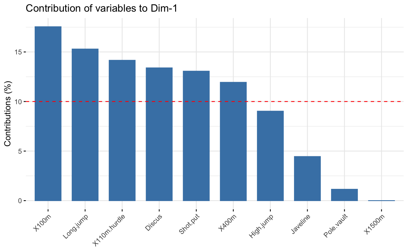
The function fviz_contrib() creates a barplot of row/column contributions.
A reference dashed line is also shown on the barplot. This reference line
corresponds to the expected value if the contribution were uniform.
For a given dimension, any row/column with a contribution above the reference line could be
considered as important in contributing to the dimension.
See also
fviz_cos2, get_pca.
Online tutorial: Principal Component Analysis (PCA) in R: Compute, Visualize & Interpret.
Author
Alboukadel Kassambara alboukadel.kassambara@gmail.com
Examples
# \donttest{
# Principal component analysis
# ++++++++++++++++++++++++++
data(decathlon2)
decathlon2.active <- decathlon2[1:23, 1:10]
res.pca <- prcomp(decathlon2.active, scale = TRUE)
# variable contributions on axis 1
fviz_contrib(res.pca, choice="var", axes = 1, top = 10 )
 # Change theme and color
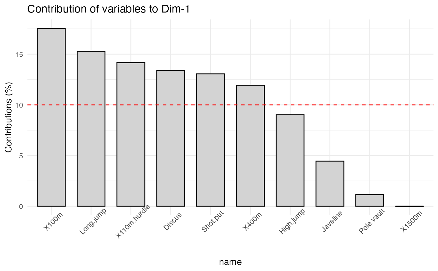
fviz_contrib(res.pca, choice="var", axes = 1,
fill = "lightgray", color = "black") +
theme_minimal() +
theme(axis.text.x = element_text(angle=45))
# Change theme and color
fviz_contrib(res.pca, choice="var", axes = 1,
fill = "lightgray", color = "black") +
theme_minimal() +
theme(axis.text.x = element_text(angle=45))
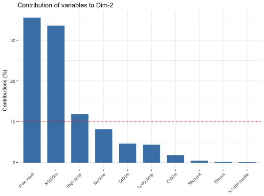
 # Variable contributions on axis 2
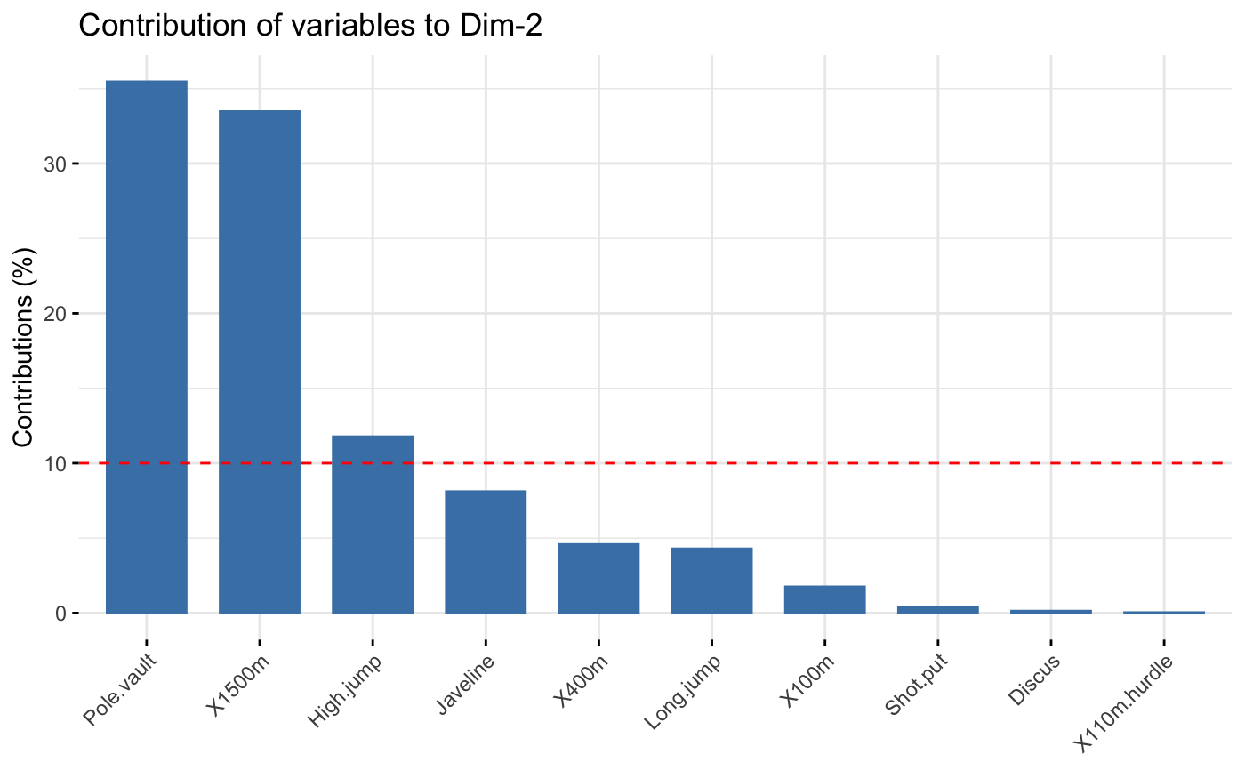
fviz_contrib(res.pca, choice="var", axes = 2)
# Variable contributions on axis 2
fviz_contrib(res.pca, choice="var", axes = 2)
 # Variable contributions on axes 1 + 2
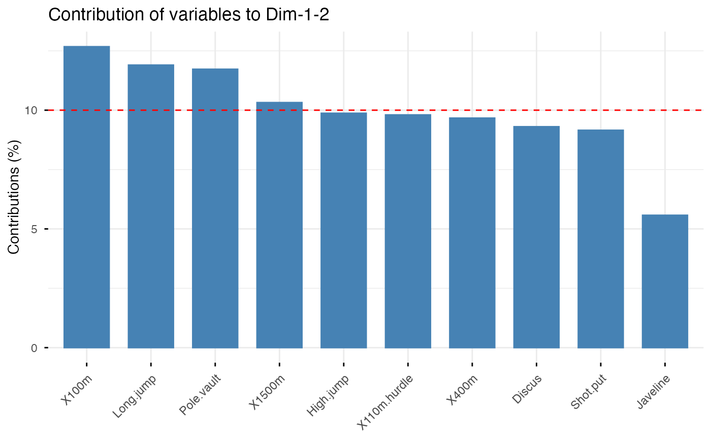
fviz_contrib(res.pca, choice="var", axes = 1:2)
# Variable contributions on axes 1 + 2
fviz_contrib(res.pca, choice="var", axes = 1:2)
 # Heat-grid of contributions across several dimensions
fviz_contrib(res.pca, choice = "var", axes = 1:3, display = "heatmap")
# Heat-grid of contributions across several dimensions
fviz_contrib(res.pca, choice = "var", axes = 1:3, display = "heatmap")
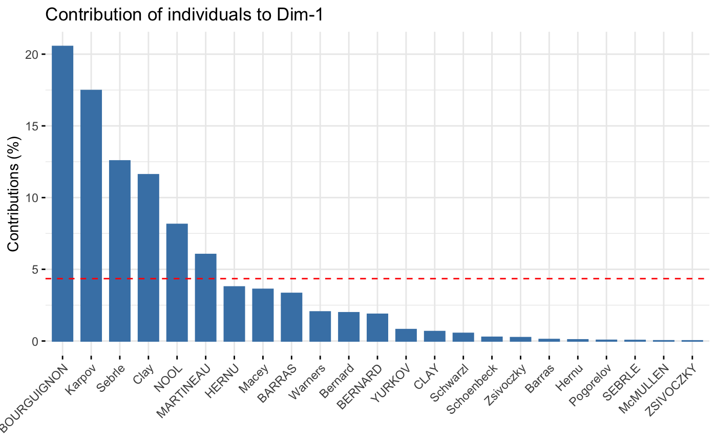 # Contributions of individuals on axis 1
fviz_contrib(res.pca, choice="ind", axes = 1)
# Contributions of individuals on axis 1
fviz_contrib(res.pca, choice="ind", axes = 1)
 if (FALSE) { # \dontrun{
# Correspondence Analysis
# ++++++++++++++++++++++++++
# Install and load FactoMineR to compute CA
# install.packages("FactoMineR")
library("FactoMineR")
data("housetasks")
res.ca <- CA(housetasks, graph = FALSE)
# Visualize row contributions on axes 1
fviz_contrib(res.ca, choice ="row", axes = 1)
# Visualize column contributions on axes 1
fviz_contrib(res.ca, choice ="col", axes = 1)
# Multiple Correspondence Analysis
# +++++++++++++++++++++++++++++++++
library(FactoMineR)
data(poison)
res.mca <- MCA(poison, quanti.sup = 1:2,
quali.sup = 3:4, graph=FALSE)
# Visualize individual contributions on axes 1
fviz_contrib(res.mca, choice ="ind", axes = 1)
# Visualize variable category contributions on axes 1
fviz_contrib(res.mca, choice ="var", axes = 1)
# Multiple Factor Analysis
# ++++++++++++++++++++++++
library(FactoMineR)
data(poison)
res.mfa <- MFA(poison, group=c(2,2,5,6), type=c("s","n","n","n"),
name.group=c("desc","desc2","symptom","eat"),
num.group.sup=1:2, graph=FALSE)
# Visualize individual contributions on axes 1
fviz_contrib(res.mfa, choice ="ind", axes = 1, top = 20)
# Visualize categorical variable category contributions on axes 1
fviz_contrib(res.mfa, choice ="quali.var", axes = 1)
} # }
# }
if (FALSE) { # \dontrun{
# Correspondence Analysis
# ++++++++++++++++++++++++++
# Install and load FactoMineR to compute CA
# install.packages("FactoMineR")
library("FactoMineR")
data("housetasks")
res.ca <- CA(housetasks, graph = FALSE)
# Visualize row contributions on axes 1
fviz_contrib(res.ca, choice ="row", axes = 1)
# Visualize column contributions on axes 1
fviz_contrib(res.ca, choice ="col", axes = 1)
# Multiple Correspondence Analysis
# +++++++++++++++++++++++++++++++++
library(FactoMineR)
data(poison)
res.mca <- MCA(poison, quanti.sup = 1:2,
quali.sup = 3:4, graph=FALSE)
# Visualize individual contributions on axes 1
fviz_contrib(res.mca, choice ="ind", axes = 1)
# Visualize variable category contributions on axes 1
fviz_contrib(res.mca, choice ="var", axes = 1)
# Multiple Factor Analysis
# ++++++++++++++++++++++++
library(FactoMineR)
data(poison)
res.mfa <- MFA(poison, group=c(2,2,5,6), type=c("s","n","n","n"),
name.group=c("desc","desc2","symptom","eat"),
num.group.sup=1:2, graph=FALSE)
# Visualize individual contributions on axes 1
fviz_contrib(res.mfa, choice ="ind", axes = 1, top = 20)
# Visualize categorical variable category contributions on axes 1
fviz_contrib(res.mfa, choice ="quali.var", axes = 1)
} # }
# }